
Colin
.
- Joined
- Jun 29, 2016
- Messages
- 2
- Likes
- 1
Alright, so I am entirely new to this portablizing scene and I have been spending a lot of my time reading up on electrical engineering for when I start constructing my first portable. I have practically ZERO experience working with wiring or actually constructing with hardware, and I haven't taken a class on it yet at my highschool (planning on doing it this coming year though). That out of the way, there is something I DO have experience in, and that is graphic design. Digital art is something I have been doing for a long time now, and I feel like I could really help PortablizeMii out in this regard. While PortablizeMii is functional, I felt it (postLoader) would look a lot better with a cleaner, more "Wii-like" design to go with its functionality. So I have spent a few hours going through PortablizeMii's PNGs and replacing them with updated ones I have created. I am planning on updating all of the graphics, but I have run into a few problems: First, I don't actually own a Wii at this current point in time because I destroyed my last one practicing trimming the mobo, so I can't exactly test any of the things I've made to see if they work. Second, there are a few files I don't exactly want to have in the updated design (like the 5 backgrounds in the bkg folder-- I'd rather only have 1 background consistant throughout postLoader), and I think if I remove the files altogether it will cause problems with PortablizeMii (correct me if I'm wrong). Lastly a lot of the icons are REALLY low resolution, and I want to replace them with more detailed, higher resolution icons but I think this will cause issues as well. I'm trying to keep the new files the same size as the old files, but it isn't exactly the easiest to do.
With that out of the way, these are the replacement files I have made:

heres an updated pointer icon, its the original wii cursor with the number erased off the back and the gradient recreated
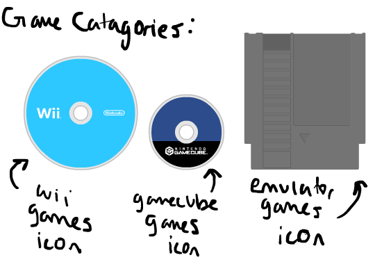
These are updated category icons. I still have to make icons for the Homebrew and WiiWare categories, and I'm still not entirely satisfied with the icon I made for the Emulator category. I don't feel like it blends well with the other two. I wanted to make it an NES cartridge to represent old games, because that's what I think of when I think 'Emulator'. That one took the most time (like 4 hours). The other two came out really well, I based them off the Wii Disc Channel when a disc isn't inserted.
Sorry for writing a book, just wanted to let everyone know what's going on. Hopefully I can finish all the icons within this month. Thanks guys.
**(Also, I want to reemphasize that the old graphics were NOT bad, and I have no harmful intent towards the original creators, I just have a different vision for how they could look)
With that out of the way, these are the replacement files I have made:
heres an updated pointer icon, its the original wii cursor with the number erased off the back and the gradient recreated
These are updated category icons. I still have to make icons for the Homebrew and WiiWare categories, and I'm still not entirely satisfied with the icon I made for the Emulator category. I don't feel like it blends well with the other two. I wanted to make it an NES cartridge to represent old games, because that's what I think of when I think 'Emulator'. That one took the most time (like 4 hours). The other two came out really well, I based them off the Wii Disc Channel when a disc isn't inserted.
Sorry for writing a book, just wanted to let everyone know what's going on. Hopefully I can finish all the icons within this month. Thanks guys.
**(Also, I want to reemphasize that the old graphics were NOT bad, and I have no harmful intent towards the original creators, I just have a different vision for how they could look)
